Friday, 3 October 2014

Assignment 3 commentary


For assignment 3 we were asked to produce 'about 4 photographs' for each of the following:

Colour harmony through complimentary colours
Colour harmony through similar colours
Colour contrast through contrasting colours
Colour accent using any of the above

In addition to the four objectives listed above we were also instructed to 'vary the subject matter, including both arrangements and found situations'.


"We know the original relation of the theatre and the cult of the Dead:  the first actors separated themselves from the community by playing the role of the Dead: to make oneself up was to designate oneself as a body simutaneously living and dead: the whitened bust of the totemic theatre, the man with the painted face in the Chinese theatre, the rice-paste makeup of the Indian Kathakali, the Japanese No mask... now it is the same relation which I find in the Photograph; however "lifelike" we strive to make it (and this frenzy to be lifelike can only be mythic denial of an apprehension of death), Photography is a kind of primitive theatre, a kind of Tableau Vivant, a figuration of the motionless and made up face beneath which we see the dead."
Roland Barthes, Camera Lucida (1)


Images - please view slideshow on a full screen.  Exif data can be found behind the 'i' under each image after you exit the slide show
Colour maps and specific image notes
Rejected images and early ideas

Working with Colour - Colour has been difficult to get my head round.  However, having spent quite a lot of time doing and redoing shots for this assignment I am now pretty clear about the primary and secondary colours and which ones contrast with which, etc. I am also very aware of how the texture and quality of different cloth works under different light, how some objects and materials change colour entirely depending on light, aperture and speed; and of how some coloured items are more inclined to loose all their structure under certain conditions and just become a blob of colour with little definition.

When I first started to think about "Colour" I wasn't thinking about all the technical aspects but was instead reminded of powerful memories from my childhood, which I discussed in an earlier post.  At that time, I wasn't sure what I wanted to do but I knew colour triggered strong sense memories in the same way smell or sound might.

I also recalled productions I have seen by Robert Wilson and Robert Lepage where colour and other simple theatrical techniques were used in an evocative way to transport their audience into a different realm; one that seems to go beyond the conscious world and explores inner landscapes.

In part the work may also be a response to images of women I have seen specifically in the last few months and which I have discussed in my blog.

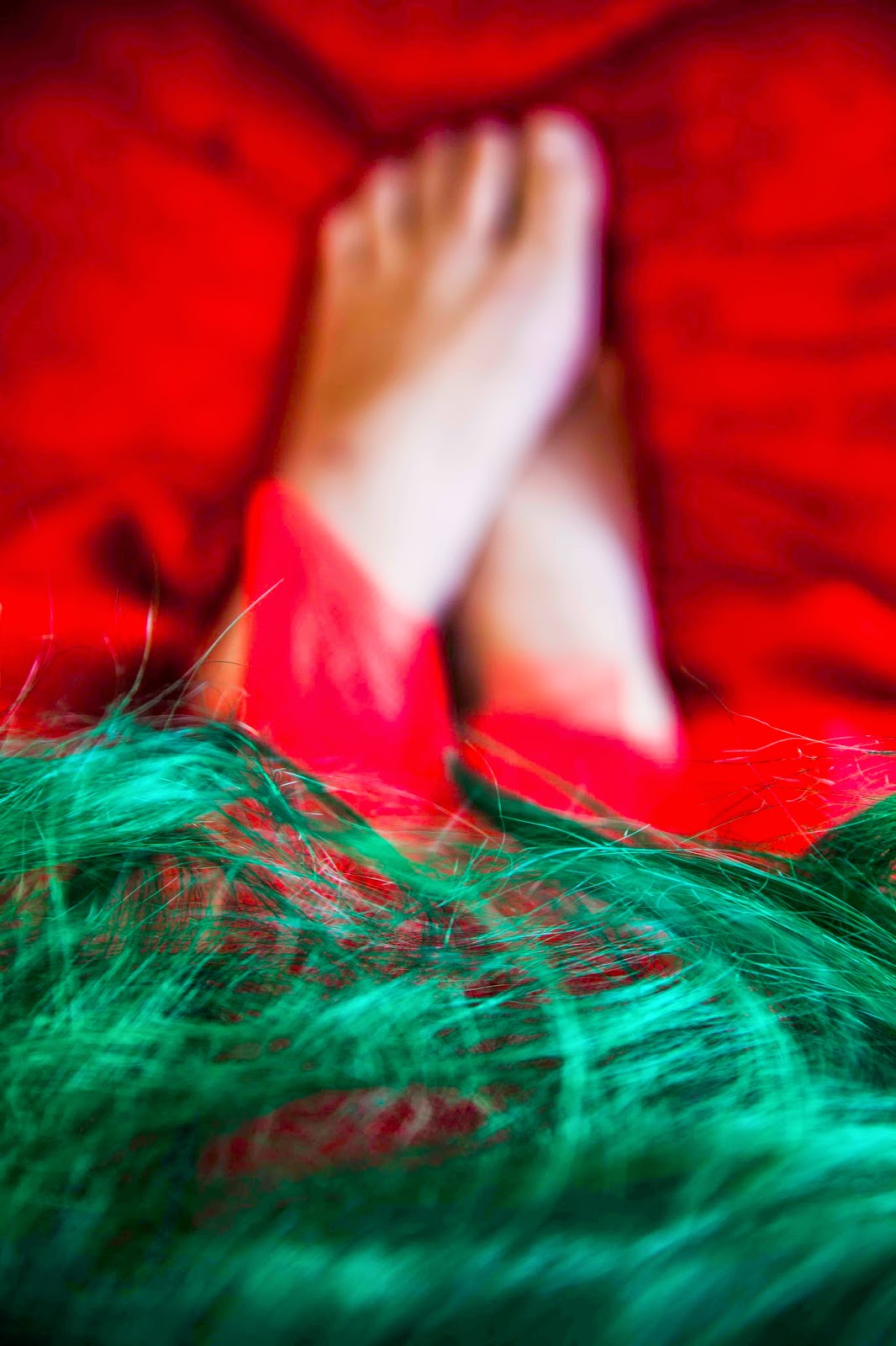
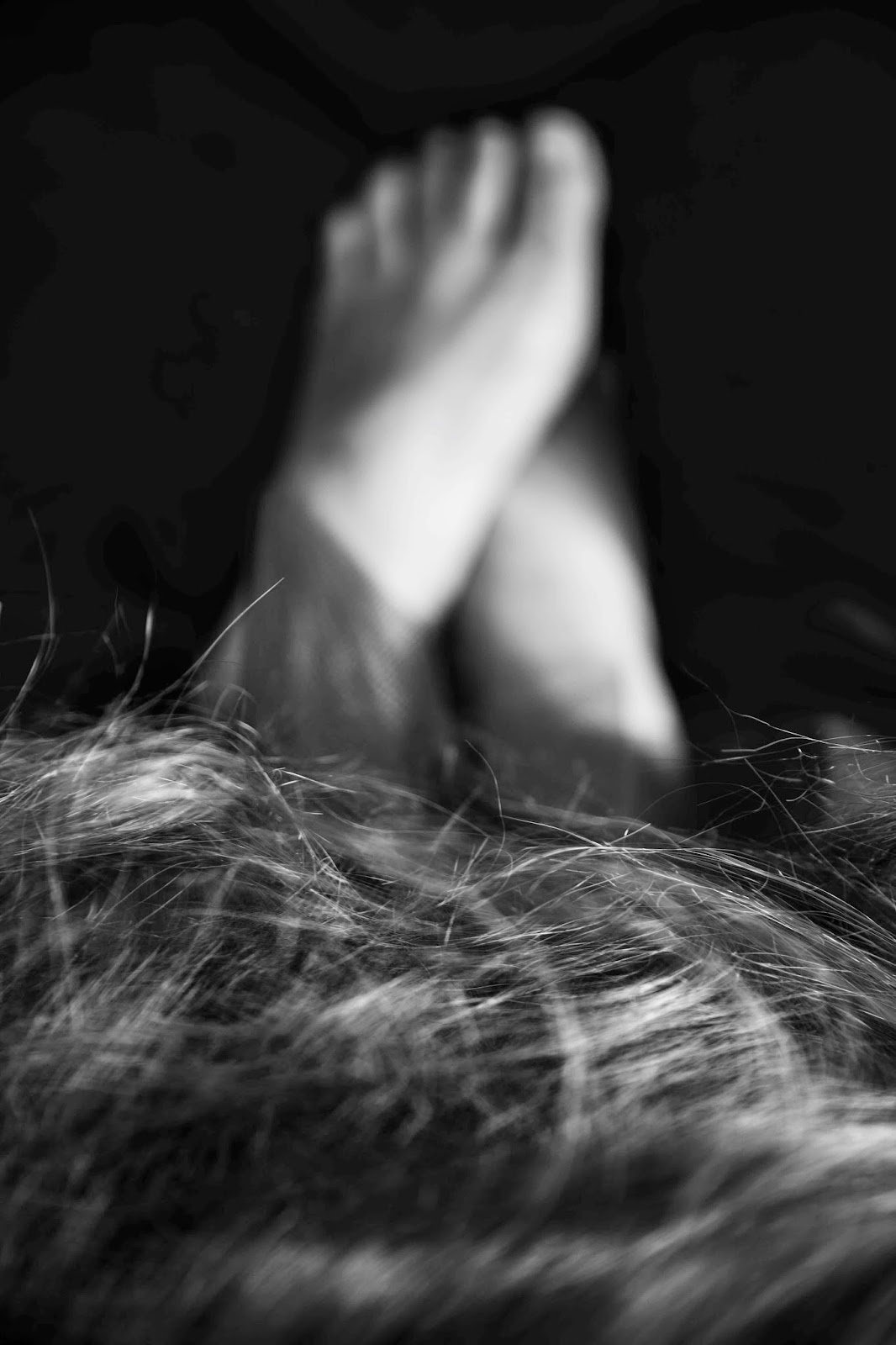
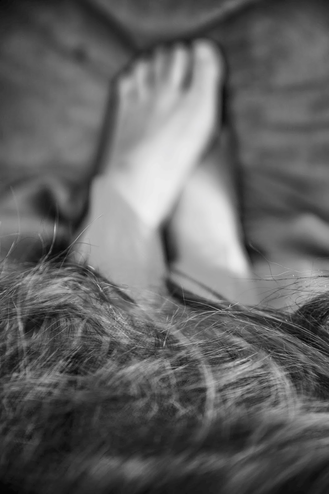
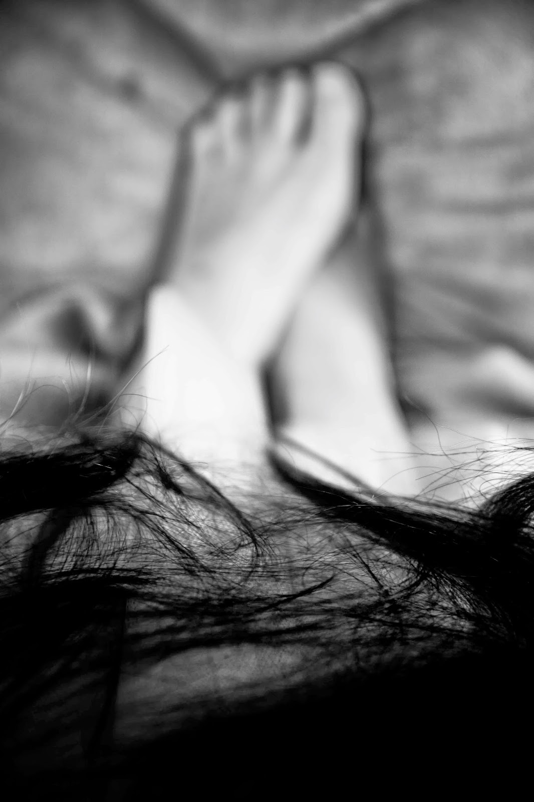
To sum up, I think these images explore what it is to be female in our society, about some of the confusion and difficulties that surround us.  I am also very aware, however, they evoke aspects of how my own life has felt over the last several years and perhaps where I am now.   I have taken Barthes’ quote in a very literal way and played with notions of death whilst trying to instil a sense of life, using motion blur and contrasting it with the "motionless" nature of a photograph.
I hope I have conveyed something evocative using colour, and which goes beyond the parameters of producing a number of coloured images which fit neatly under the headings of contrasting, harmonious, similar and accent.

I should say I was (am) quite conflicted about the images I have used and worried about the criteria which states we should vary the subject matter.  I know I haven't done this but instead opted to create a set of images that hold together.  I do believe I have 'found' lots in the images but rather than wandering around to find them I have found them in the confines of my little makeshift studio/bedroom.  (Too much liberty with language?) For many reasons I am somewhat worried about posting these images, I have to say.  I know they won't be everyone's cup of tea!  And I am worried again that I've gone completely off in the wrong direction.


(1) Camera Lucida by Roland Barthes, published by Vantage Books 200, Originally published in French as La Chambre Claire by Editions du Seuil 1980, first published by Vantage in 1993

Assignment 3 colour maps and notes for individual images

1. I am not sure if this actually constitutes an accent.  At any rate the red is on black rather than a colour.  


2. This was taken in the first batch of photos I tried.  I liked the way there was a 'ghost' but the actual main section was more or less in focus.  Not all the images do this but I have spent a lot of time trying to get that effect.  Although red and blue are contrasting colours, the red becomes a much darker in the shadows moving closer to violet which is similar to the blue.


 3. Red and orange are similar and the different variations of the these colours all seem to stay within the same part of the colour circle.  I like the softeness. The yellow is created by the light which was very yellow, however, I have used Lightroom to enhance that.


 4. The red lips work as an accent against the green hair.  The hand is quite yellow which is similar to the green.


5. Red and yellow are contrasting colours.  The hair has orange in it from the way it is lit and orange is similar to both the contrasting colours.


 6. Red accent on green.  The green is similar to the blue fabric.


 7. This one is complicated.  I wanted to have violet and yellow and the blue wig is often purple when not lit.  But I also wanted some lighting so the image is harmonious in that it has yellow and violet but also contrasting between the yellow and blue and harmonious between the blue and violet.


 8. Red and orange are similar colours.  The very clear second exposure from the long shutter speed also shows the hair lit which turns brown hair to red.


 9. This is orange and violet which contrasts.  But the violet is also blue in places and is in reality very blue.  I really questioned this image because it is so undefined but in the end it fitted shape wise and also being totally undefined at times is probably an accurate portrayal.


10. Red and green are harmonious colours and apart from the slight yellow highlights I think this one is pretty straightforward.


 11. This is mostly similar because of the pink and purple but then that wig does it's thing again and the lit up part is blue which contrasts.  I think this may be the most successful image of all of them and perhaps by quite a long way.


 12. Pink and red and orange, similar.  I think the most troubling thing with this one and some others that are very blurry is how they might print.  Blogger doesn't cope with the colours here very well at all so please make sure you view it on the slide show!  (I like the opposing tension in this shapes here which I have to say is thanks to a director called Bill Hopkinson who I worked with 20 years ago  at drama school.  I wouldn't do what he was asking then for some reason, but a variation has worked well here all these years later.)


 13. I like this image.  It's purple with red which are similar but the yellow lighting on the blouse and face is harmonious with the purple scarf, and contrasting with the red wig.  Seeing this image now I feel it needs to be cropped ever so slightly.


14. Red and blue contrasting.  I nearly didn't use this as there is no blur at all so wondered if it didn't fit with the rest.  But the skirt does have an element of translucence.  And the tone of the image sort of fits in with the narrative if there is one at this point in the sequence.


15. I have to say this image is one that I am really uncertain about... it may be that it is just too ridiculous to the point of being hilarious.  Anyway, it's meant to be an example of a red accent especially with the pattern on the blouse.

Sunday, 21 September 2014

Wynne Bullock: Revelations

“Mysteries lie all around us, even in the most familiar of things, waiting to be perceived.” [1]

Wynne Bullock, Revelations Introduction, 2014,
University of Texas Press and the High Museum of Art

The quote above couldn’t be more appealing to me.  When I first read about Wynne Bullock in photographer Douglas Stockdale's blog I was immediately drawn to his work and wanted to find out more.  Wynne Bullock was a key figure in American photography during the period that I am beginning to understand is so important in American photographic history  – 1940’s to the 1970s.   His works Child in Forest and Let There Be Light both appeared in the Family of Man exhibition at MOMA in 1955, a landmark event which toured for 8 years and celebrated human existence and all its joy and horror following the war years. 

Bullock was born in 1902 and died in 1975.  After he finished school he pursued a concert-singing career which took him to France where he became interested in visual art.  He studied photography at the Los Angeles Art Centre School from 1938-1940, starting his photography career later than his contemporaries had done.  (I try to take comfort from this as I’m a only a few years older than Bullock was when he began; ok, maybe more than a few years but we live far longer nowadays!)  Bullock was part of the West Coast photography tradition working with and friends of Edward Weston and Ansel Adam’s amongst others.[2]

“His early work is deeply experimental.  Drawing direct inspiration from his exposure to Man Ray and Maholy Nagy, as well as that of his Art Centre teacher Edward Kaminski, Bullock began working to control tonal reversals in his photographs by subjecting them to pulses of light in the processing and printing stages, thereby creating evocative figure studies similar to the solarisations he had become acquainted with in Europe”[3] Like Paul Himmel and Lillian Bassman, who also had work included in the Family of Man exhibition, Bullock was interested in experimenting with processes and in-camera effects – It struck me that I am repeatedly and unknowingly drawn to photographers who like to play with their equipment and processing techniques and who enjoy pushing the boundaries.

Wynne Bullock’s work is very much linked to the ideas and philosophies he was so interested in.  One of his main fascinations was with the work of Einstein and the theory of relativity as well as the difference between existence and reality.   His collection of books, all richly annotated, is testament to a deeply intellectual basis from which he practiced his art throughout his career.

Light itself was extremely important to Bullock, not just as a crucial element for photography but as a subject in itself.  Many of his images explored light and like the Dadaists he enjoyed relying on chance to realise some of his work; for instance Gravitation Acceleration was created by hanging “a small light pendulum over an unexposed sheet of film and allowing the forces of gravity and acceleration to construct a composition for him.  Given a push by the artist, the swinging light traced a precise design over the negative…”[4]  ‘Light to me is perhaps the most profound truth in the universe”. [5]

Bullock believed, like the artist Paul Klee, that art should “not reproduce the visible but ‘make visible’”[6] and his experimental abstract work, using solarisation, reticulation (subjecting the print to varying temperatures while processing in order to create cracks and bumps and faults  – which reminds me a bit of using Snapseed and other such apps to paste scratches and make holes in iPhone images), upside-down prints (I’ve done that!) and negative reversals are all used to recreate the reality he was photographing and see the world from a fresh place, much like Brecht did with his alienation affect. “Reality is as much about how you look as where”.[7]

I am extremely taken with Bullock’s attitude that “an individual must live passionately and sincerely”[8] which is the philosophy that informed his work and life.  I think there is much to learn from this position.

One of the things that I am beginning to find difficult to absorb and contend with as I study more and more photographers and other artists is the practice of photographing women without their clothes on, especially women laying down in particular poses, draped languidly and looked utterly unreal, as opposed to more genuine images of women such as Jodi Bieber’s Real Women [9] for instance. (I know it is unfair to compare, as these two photographers are working at very different times in history and are different types of photographer.  I was recently advised to look at Jodie Bieber and was so pleased to see this work that celebrates woman as they are; not alabaster fantasies or anorexic marketing tools.  The difference in her approach immediately struck me as I'd just been looking at Bullock's).  

Of course, there is a long tradition of ‘the nude’ in Western and other art throughout our histories.  And I am sure it seemed like a perfectly reasonable thing to do in a different time but it seems less reasonable now in my eyes, although I know it continues.  Perhaps this is an example of some form of cultural myopia on my part?  A few of my images had recently been invited to a group on Flickr that I briefly looked at and understood to be for black & white images. It wasn’t until I looked more carefully that I realized the group was actually black and white erotica – I was amazed by some of the images, I have to say, and I never thought of myself as some sort of reactionary Mary White house type – quite the opposite actually.  It’s not the nudity I have a problem with.  It’s the attitude that it’s fine to ‘gaze upon’ women as if they were fresh meat, alabaster and perfect.  Surely we have all moved on … apparently not.  I thought perhaps there was as chance I was being a cultural philistine when looking at Bullocks naked females but a quick internet search confirmed that feminist academics have collectively written quite a lot on female nudity in western art, and it’s a relief to know I’m not the only one who thinks it’s an outdated habit that could arguably be consigned to history.  Nevertheless I do worry I am missing something important and profound by being so nonplussed with these images.

“’By looking at the nude, I stopped thinking in terms of objects,’ Bullock explained. ‘I was seeing things, instead, as dynamic events, unique in their own beings yet also related and existing together within a universal context of energy and change”.[10]

I am more than a bit ambivalent about the images of nude women in Bullock’s work.  I can see that the work is important and that he is looking at realities that don’t immediately present themselves to us in our everyday lives.  But I can’t get over these examples of the male/female relationship that exist in our world, and one which allows such images to be considered more than fine.  Do we really have to undress women to stop seeing things in terms of objects?  Isn't that the opposite of what is happening anyway?  I don’t think every image that contains naked women is indicative of that attitude.  I think maybe Navigation without Numbers just about escapes it as the naked baby at least gives the woman something to relate to other that her nakedness - although she isn't relating to it at all; here there is something surreal and disturbing, why is the baby so far from it’s mother, why is there a vast black space between them, why do they both look down?  I would like to know more about this photograph.  I much prefer Lynne, Point Lobos or Child On Forest Road to any of the pictures of his daughter without her clothes, even though I know the Child in Forest is an important and well known work.  In the two aforementioned images the power of the natural world in relation to the small children is overwhelming and vast, and yet the children exist within it and will grow up and eventually die, and always be part of that world and its perpetual cycles too. And they didn't even have to be naked.

I really do like the abstract images and landscapes (sans naked women).  They are profoundly beautiful and imbued with the philosophies that Bullock was so interested in.  I think I will look at them a great deal.


Quotations taken from the  introduction to Wynne Bullock, Revelations, copyright © 2014 University of Texas Press and The High Museum of Art
[1] Page 6
[2] Page 9
[3] Page 3
[4] Page 3
[5] Page 4
[6] Page 12
[7] Page 6
[8] page 12
[10] Page 8

Thursday, 18 September 2014

Colour thoughts

My assignment continues to evolve. I don't think this is a bad thing but it does slow me down which is fine if I'm working on my own projects but not ideal if I were trying to deliver a paid assignment with a deadline.  I'm struggling to know how to finish the project I have started, how to bring it to a satisfying close.  I have taken some risks with the photography and also with a decision I've made to include some images that I have not taken and I'm not sure if this is acceptable or not.  I am able to justify the inclusion of those images but who knows if it will be OK.  However, all of that is irrelevant if I cannot come up with a way to finish the project.

Each idea I try ends up being rubbish and I think what I need to do is settle on something and try to make it work.  Frustrating!!


Monday, 15 September 2014

Black & White - Filters

Take one image if using digital and convert using the presets in Photoshop to Black & White (mimicking the filters one would have used if photographing with film)

Create 5 monochrome versions digitally using the preset settings to emulate filters.  This is about understanding colour and tones and 'putting it to work in black & white'.  Having done this I am amazed by the differences in each image and think I will pay far more attention to the way I convert images in future, as well as think about what colours to use in the original as the red and green below have adjusted with extreme differences depending on which emulated filter was used.  There are many more possibilities available to me that I had previously imagined.

The image is a bit odd, I know.  I was playing around with potential props and this is what I came up with.  I used it because I quite like it but also because the colours worked well.  Would love to say it has some erudite and surreal, intellectual origin but I can't say it does.  But I do like to play and see what comes out of it.  When I look at this image, perhaps rather morbidly but actually I do find it amusing, I can't help thinking about corpses (my own corpse) in their coffins being outlandishly dressed up and if this were a corpse - she does indeed seem to have a very long green beard!  My favourite I think might be the blue emulated filter, although I am also fond of the red filter.  I can't work it out.

Original ISO 100 58mm f2.8 1/30sec
Straight conversion in Photoshop under Image and Adjustments

Blue

Green
Yellow
Red


Friday, 12 September 2014

Todd Hido


Todd Hido is an American photographer and artist who lives in San Francisco and who studied under Larry Sultan.  He was born in 1968 and teaches as well as practicing and exhibiting.  Some of his work has been used for book covers notably novels by Raymond Carver.
Many of his photographs are of urban and suburban spaces that give a sense of bleak loneliness, isolation, emptiness.  He also photographs interiors that convey similar feelings of personal alienation.  Nearly all his photographs of buildings are taken at night or early morning.  The lights are always on inside the houses and apartments he photographs (apart from one image at the date of the interview - link below) and that luminescence seems to convey a sense of who the humans inside are.  The light appears to have personality and emotion.
One of the most interesting things for me at this moment as I look at Part 3 of TAOP is the colour in Hido’s works. 
He uses analogue film and produces large highly detailed prints.  Light in every photograph plays a major role and the colour of that light conveys character and mood.
I have looked specifically at Todd Hido’s work in relation to my own colour assignment work.  The very distinct colour and the way Hido uses light is extremely interesting and evocative and crucially reminds me that there is more than one way to incorporate colour into an image.
In addition to Hido’s landscapes he also produces portraits of women in similar interiors to the ones he makes without people, images that I find upsetting.  I am particularly interested in these.  When I first came across them after someone on Flickr had suggested I look at Todd Hido’s work I felt enraged by the images - perhaps, according to a few, demonstrating a naivete in me, as far worse images of women exist in vast quantities, some hidden from everyday life and some blatantly on display as if such images were perfectly acceptable: page 3 models advertised as six foot posters on buses is one example - and in fact Todd Hido's images are far, far more honest and real than page 3 images which are frankly ridiculous, fantastical and offensive.  Todd Hido looks at the undercurrent of such images, I think.  Some of Hido's images I am referring to paint a seedy, lonely sense of powerlessness.  It infuriated me that women should be depicted this way in this context.  I must add that there are also portraits of women in his work who seem empowered and at ease with themselves.  However, I am discussing images where that is not the case.  I don't think I was enraged by Todd Hido himself who is merely exploring something that exists in the world and is worth looking at for sure - and I understand that possibly he is questioning a reality and asking his viewers to confront something difficult.  But I certainly felt furious by the fact that women in that light should exist at all, dis-empowered, diminished.  Maybe it is something to do with where I was at the time.  Maybe I'm just being judgmental and censorious.  I suspect, however, there is an extremely accurate reflection of how some men like to see women in the images and of how women sometimes can be.  That women should be there at all, or anyone else for that matter is enraging.  What I see in the images is a sense of abusive power, within the fantasy depicted, and deep, deep loneliness in every player within the image – the women, the implied presence of an Other (male) even if he may have left the scene, the photographer, and finally in the viewer.  There is a desperately lonely and vulnerable sense to many of these women, isolated, undressed, in bleak rooms.  I don’t see strength.  One of the things that comes to mind when I look at the images is that these women were once little girls with dreams and fantasies and hopes.  And that all of that has become warped, degraded and lost.  Lost hope.
Hido is extremely present in all his images.  But this is most apparent in the series where he has taken photographs from behind the windscreen of his car or through his car door window.  The texture of the rain falling on the window or of the dirt on the windscreen reminds us of his being there, photographing these scenes.  His mood is conveyed very clearly I think.  Thinking about the photographer as a crucial part of the whole scene is something I have not considered in depth before, which seems a little odd.
I have returned to these images after seeing them initially a few months ago because the themes that I mention here – the degradation of those little girl’s dreams and hope is something that I think I am exploring in the work I’m preparing for the colour assignment, although certainly from a woman's point of view and obviously with a woman's way of approaching it.  It’s difficult to be certain as I’m still working on it and I’m not entirely sure where it is going (or if I even like or value it!).  But returning to Hido’s work will no doubt have some impact.


Information gleaned from Wikipedia, ToddHido.com and an interview from Ahorn Magazine – (2008-11)


Monday, 8 September 2014

Tha National Gallery - Making Colour


Is it merely serendipitous good fortune that there is a major exhibition on Colour at the National Gallery as well as screenings of A History of Art in Three Colours just as I begin Part 3 of the Art of Photography – Colour?  Or is colour constantly explored in this way but I’ve never noticed before because I’ve not really been looking out for it.  It does seem a bit weird, to be honest - perhaps fortunate nevertheless.

I have found colour incredibly difficult to grapple with.  The theory in a way may as well be a maths problem (not my forte) for all the sense it makes to me at the moment.  Why should green and red be complimentary just because someone put them on the opposite sides of a circle?  They seem in my mind to clash dreadfully but of course I must be wrong and if I think about Christmas time, certainly here in Northern Europe, the base colours of the commercial Christmas palate seems to be red and green which is always extremely nostalgic, warming and inviting (although for some I believe the time itself rather than the colours are alienating, depressing and even horrific, Christmas being one of the worst times for suicide although of course that may just be apocryphal).  Nevertheless I’m at times utterly confused and had to reread the following several times, go back and look at the colour circle plus the definition of complimentary colours to make sure I’d not got it completely wrong;

‘I have tried to express the terrible passions of humanity by means of red and green…( )...Everywhere there is a clash of the most disparate reds and greens…”[1]
Vincent Van Gough said about his painting The Night Café.  Having looked at the painting more closely, however, I begin to see that it is the yellow in the painting that is a contrasting colour to red but a similar colour to green if I’m understanding things correctly, which seems to give the painting a sense of unease rather than the red and green.  Lots of conflicting energy between the various colours.

I hoped that by visiting the Colour exhibition I would feel less confused and frankly at times bewildered by the whole colour aspect of things.  But although I enjoyed looking at some of the paintings I didn’t feel any the wiser when I came out.

It was however fascinating to learn at the exhibition and when I watched some of the History of Art in 3 Colours about just how important colour has been over the centuries.  (I most enjoyed learning about Yves Klein in the BBC 4 documentary and his obsession with blue, although that was far beyond the time that the exhibition was looking at.)

The art was European and spanned the years from the early Renaissance up to the Impressionists.  The two things I enjoyed seeing the most was Turners paint box which was a wonderful object to actually look at and Monet’s Lavercourt under Snow (1878 – 1871).  It seemed to me that you could feel the icy cold.  I read that the Impressionists frequently used ‘half shadows tinted with the complimentary (opposite) colour of the highlights’[2].  I tried this in Lightroom on a landscape I’d taken to see if I could give it an Impressionist feel – it didn’t work but I will have another go when I have photographed something suitable.

I do feel that although colour has been a challenge something of what I am learning is sinking in, if only that one can achieve specific effects by thinking of colours and how they work together or don't.  I give more advice about choosing colours to my clients - all gleaned and borrowed (very honesty I might add!) from the Internet and it has without a doubt had an impact on the potential for more satisfying commercial family orientated images - the sort that people will want to pay me to  take. 


[1] Page 16 The National Gallery A Closer Look at Colour 2000, revised 2009
[2] Page 15 The National Gallery A Closer Look at Colour 2000, revised 2009