Showing posts with label Part 3. Show all posts

Friday, 3 October 2014

Assignment 3 commentary


For assignment 3 we were asked to produce 'about 4 photographs' for each of the following:

Colour harmony through complimentary colours
Colour harmony through similar colours
Colour contrast through contrasting colours
Colour accent using any of the above

In addition to the four objectives listed above we were also instructed to 'vary the subject matter, including both arrangements and found situations'.


"We know the original relation of the theatre and the cult of the Dead:  the first actors separated themselves from the community by playing the role of the Dead: to make oneself up was to designate oneself as a body simutaneously living and dead: the whitened bust of the totemic theatre, the man with the painted face in the Chinese theatre, the rice-paste makeup of the Indian Kathakali, the Japanese No mask... now it is the same relation which I find in the Photograph; however "lifelike" we strive to make it (and this frenzy to be lifelike can only be mythic denial of an apprehension of death), Photography is a kind of primitive theatre, a kind of Tableau Vivant, a figuration of the motionless and made up face beneath which we see the dead."
Roland Barthes, Camera Lucida (1)


Images - please view slideshow on a full screen.  Exif data can be found behind the 'i' under each image after you exit the slide show
Colour maps and specific image notes
Rejected images and early ideas

Working with Colour - Colour has been difficult to get my head round.  However, having spent quite a lot of time doing and redoing shots for this assignment I am now pretty clear about the primary and secondary colours and which ones contrast with which, etc. I am also very aware of how the texture and quality of different cloth works under different light, how some objects and materials change colour entirely depending on light, aperture and speed; and of how some coloured items are more inclined to loose all their structure under certain conditions and just become a blob of colour with little definition.

When I first started to think about "Colour" I wasn't thinking about all the technical aspects but was instead reminded of powerful memories from my childhood, which I discussed in an earlier post.  At that time, I wasn't sure what I wanted to do but I knew colour triggered strong sense memories in the same way smell or sound might.

I also recalled productions I have seen by Robert Wilson and Robert Lepage where colour and other simple theatrical techniques were used in an evocative way to transport their audience into a different realm; one that seems to go beyond the conscious world and explores inner landscapes.

In part the work may also be a response to images of women I have seen specifically in the last few months and which I have discussed in my blog.

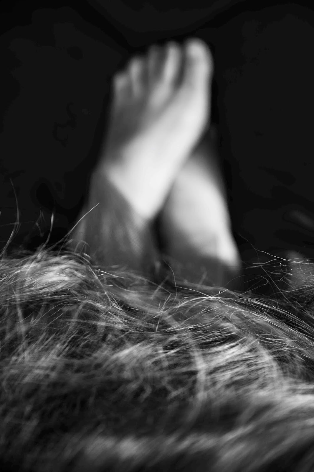
To sum up, I think these images explore what it is to be female in our society, about some of the confusion and difficulties that surround us.  I am also very aware, however, they evoke aspects of how my own life has felt over the last several years and perhaps where I am now.   I have taken Barthes’ quote in a very literal way and played with notions of death whilst trying to instil a sense of life, using motion blur and contrasting it with the "motionless" nature of a photograph.
I hope I have conveyed something evocative using colour, and which goes beyond the parameters of producing a number of coloured images which fit neatly under the headings of contrasting, harmonious, similar and accent.

I should say I was (am) quite conflicted about the images I have used and worried about the criteria which states we should vary the subject matter.  I know I haven't done this but instead opted to create a set of images that hold together.  I do believe I have 'found' lots in the images but rather than wandering around to find them I have found them in the confines of my little makeshift studio/bedroom.  (Too much liberty with language?) For many reasons I am somewhat worried about posting these images, I have to say.  I know they won't be everyone's cup of tea!  And I am worried again that I've gone completely off in the wrong direction.


(1) Camera Lucida by Roland Barthes, published by Vantage Books 200, Originally published in French as La Chambre Claire by Editions du Seuil 1980, first published by Vantage in 1993


Monday, 15 September 2014

Black & White - Filters

Take one image if using digital and convert using the presets in Photoshop to Black & White (mimicking the filters one would have used if photographing with film)

Create 5 monochrome versions digitally using the preset settings to emulate filters.  This is about understanding colour and tones and 'putting it to work in black & white'.  Having done this I am amazed by the differences in each image and think I will pay far more attention to the way I convert images in future, as well as think about what colours to use in the original as the red and green below have adjusted with extreme differences depending on which emulated filter was used.  There are many more possibilities available to me that I had previously imagined.

The image is a bit odd, I know.  I was playing around with potential props and this is what I came up with.  I used it because I quite like it but also because the colours worked well.  Would love to say it has some erudite and surreal, intellectual origin but I can't say it does.  But I do like to play and see what comes out of it.  When I look at this image, perhaps rather morbidly but actually I do find it amusing, I can't help thinking about corpses (my own corpse) in their coffins being outlandishly dressed up and if this were a corpse - she does indeed seem to have a very long green beard!  My favourite I think might be the blue emulated filter, although I am also fond of the red filter.  I can't work it out.

Original ISO 100 58mm f2.8 1/30sec
Straight conversion in Photoshop under Image and Adjustments

Blue

Green
Yellow
Red


Friday, 12 September 2014

Todd Hido


Todd Hido is an American photographer and artist who lives in San Francisco and who studied under Larry Sultan.  He was born in 1968 and teaches as well as practicing and exhibiting.  Some of his work has been used for book covers notably novels by Raymond Carver.
Many of his photographs are of urban and suburban spaces that give a sense of bleak loneliness, isolation, emptiness.  He also photographs interiors that convey similar feelings of personal alienation.  Nearly all his photographs of buildings are taken at night or early morning.  The lights are always on inside the houses and apartments he photographs (apart from one image at the date of the interview - link below) and that luminescence seems to convey a sense of who the humans inside are.  The light appears to have personality and emotion.
One of the most interesting things for me at this moment as I look at Part 3 of TAOP is the colour in Hido’s works. 
He uses analogue film and produces large highly detailed prints.  Light in every photograph plays a major role and the colour of that light conveys character and mood.
I have looked specifically at Todd Hido’s work in relation to my own colour assignment work.  The very distinct colour and the way Hido uses light is extremely interesting and evocative and crucially reminds me that there is more than one way to incorporate colour into an image.
In addition to Hido’s landscapes he also produces portraits of women in similar interiors to the ones he makes without people, images that I find upsetting.  I am particularly interested in these.  When I first came across them after someone on Flickr had suggested I look at Todd Hido’s work I felt enraged by the images - perhaps, according to a few, demonstrating a naivete in me, as far worse images of women exist in vast quantities, some hidden from everyday life and some blatantly on display as if such images were perfectly acceptable: page 3 models advertised as six foot posters on buses is one example - and in fact Todd Hido's images are far, far more honest and real than page 3 images which are frankly ridiculous, fantastical and offensive.  Todd Hido looks at the undercurrent of such images, I think.  Some of Hido's images I am referring to paint a seedy, lonely sense of powerlessness.  It infuriated me that women should be depicted this way in this context.  I must add that there are also portraits of women in his work who seem empowered and at ease with themselves.  However, I am discussing images where that is not the case.  I don't think I was enraged by Todd Hido himself who is merely exploring something that exists in the world and is worth looking at for sure - and I understand that possibly he is questioning a reality and asking his viewers to confront something difficult.  But I certainly felt furious by the fact that women in that light should exist at all, dis-empowered, diminished.  Maybe it is something to do with where I was at the time.  Maybe I'm just being judgmental and censorious.  I suspect, however, there is an extremely accurate reflection of how some men like to see women in the images and of how women sometimes can be.  That women should be there at all, or anyone else for that matter is enraging.  What I see in the images is a sense of abusive power, within the fantasy depicted, and deep, deep loneliness in every player within the image – the women, the implied presence of an Other (male) even if he may have left the scene, the photographer, and finally in the viewer.  There is a desperately lonely and vulnerable sense to many of these women, isolated, undressed, in bleak rooms.  I don’t see strength.  One of the things that comes to mind when I look at the images is that these women were once little girls with dreams and fantasies and hopes.  And that all of that has become warped, degraded and lost.  Lost hope.
Hido is extremely present in all his images.  But this is most apparent in the series where he has taken photographs from behind the windscreen of his car or through his car door window.  The texture of the rain falling on the window or of the dirt on the windscreen reminds us of his being there, photographing these scenes.  His mood is conveyed very clearly I think.  Thinking about the photographer as a crucial part of the whole scene is something I have not considered in depth before, which seems a little odd.
I have returned to these images after seeing them initially a few months ago because the themes that I mention here – the degradation of those little girl’s dreams and hope is something that I think I am exploring in the work I’m preparing for the colour assignment, although certainly from a woman's point of view and obviously with a woman's way of approaching it.  It’s difficult to be certain as I’m still working on it and I’m not entirely sure where it is going (or if I even like or value it!).  But returning to Hido’s work will no doubt have some impact.


Information gleaned from Wikipedia, ToddHido.com and an interview from Ahorn Magazine – (2008-11)


Saturday, 12 July 2014

Some thoughts for the colour assignment - FRAGMENTS

I have been wondering how to approach the next assignment - Colour.  As well as that I have picked up one of the recommended books in a bid to 'put right' my slight lack of commitment to reading, or rather the failure to make time to do it.  And thanks to Jayne Kemp, a fellow student on TAOP, I been looking at Alexey Brodovitch's Ballet, a figure who in turn led me to Lillian Bassman & Paul Himmel, who's work I am utterly bowled over by.

In addition I downloaded a biography about Diane Arbus and couldn't help but take a peek and became engrossed (the whys for another blog post), even though I have these other two books on the go (plus a rather difficult and upsetting book about high conflict divorce and the effect it has on children, which I think I have put to one side in favour of the photography books for now - perhaps I have enough of an idea of that for the time being and it's actually preventing me from moving on with this work).

So all these different influences are swirling round in my mind at the moment which will probably go on to inform whatever I end up doing for Colour.

And while I was coming home from a family event today I remembered the sets by Robert Wilson and Robert Lepage both of whose work I was very taken with years ago when studying acting and then working, and obviously taking an interest in theatre - the thing that sprung to mind was the bold colours (and shapes) sometimes used in their set design and overall work.

I am thinking about colour and how powerful it is in creating a sense memory or deeply visceral sensation/ response.  Red, white, blue pictures theses directors create with actors, lighting and set design.

And I think I was reminded of them after seeing the work by Jessa Fairbrother, recommended by my tutor.  When I went to see something by Robert Wilson shortly after my first son was born (can't believe I left such a young baby, one who refused a bottle, for several hours - I never did it again with him or any of the others at that age!!) there was a female character whose movement was stuccato and unpredicatable: there was a very clear lack of fluidity and it reminded me of my baby son's early movements - the brain and muscles were not yet working together and so an arm or a leg would flail about randomly and unexpectedly.  So, Jessa Fairbrother's work, The Rehearsal (dedicated to Augustine) is a series of photos presented in a sequence and almost like a stop frame film but with very big jumps between each image rather than the tiny ones you'd normally expect.  This is what bought the character's movement described above to mind I think.  Fragmented movements.

The word that has been floating round my head for days is FRAGMENTED.

Like many people I suspect, my own childhood memories are rather fragmented.  I have images in my head - a room that feels very orange with soft afternoon light and curtains and a window, or crying whilst wearing a blue long sleeved t-shirt - a memory that is cemented by a photograph of me crying in that very shirt, or the red blood on a black skinned man being beaten and pushed into a van in Cape-Town by a policeman.  These are just a few examples of memories from my very early childhood that contain colours in the imagery as well as the words representing colour in the narrative I have in my mind.

The memories are powerful but I can't tell you very much beyond the little scenes that exists in my head, such as what happened before or afterwards.

The reason I think I mentioned the book above that I have put aside for now is that it goes into much detail about how the development of children who are exposed to warring parents or any form of traumatic experience can and often does lead to fragmentation.  The adults who seemingly can't help themselves from putting their children through this experience are often fragmented individuals who have failed to individuate fully and reacting in the present to traumatic events from their own childhoods.  Events that may have caused some fragmentation which is either never fully resolved or deepens under the pressure of a marriage breakdown.

Fragments of self, fragments of memory, fragments of truth, fragmented movements, fragmented communication, fragmented others

I really want to explore some of the memories, memories that contain colour, memories that are fragments from the past that stay with me always, that I describe with words that represent colour - colours that evoke some sensation, and sometimes quite powerful ones.

I understand that colour can be very evocative either because of the sensation it might trigger or because of cultural symbolism - so for instance blue has classically been seen (due in part to the expense of Lapus Lazuli I think) as powerful, regal, godlike.  And I want to try and find ways to explore using colour to communicate something connected to powerful but fragmented childhood memories that have the potential to transport a viewer (audience?)

Am I being too ambitious now - probably??  The feedback I received was that my last assignment had been ambitious even though I didn't necessarily pull it off in every instance - which I agreed with wholeheartedly. However, I am excited by this ambition - now the desire to express something feels not only possible but desirable having just sat, not entirely inanimately as I certainly absorbed a great deal but probably in quite a blocked way, for so long.

I don't know whether to follow in the style of slow shutter speed or not but looking at Lillian Bassman's work gives me tremendous encouragement and inspiration to do so.  I don't want to simply repeat myself without moving forward but fear I may do so.  I have fragments of ideas but to be honest am not really sure at all about what the final product will be - I like that though.  I'm not sure I like the idea of pinning something down to such an extent that there is no room for surprise and invention.  I struggled to learn this concept at drama school - always starting with an effective but ultimately doomed idea in my head that was too stifled to grow and exhilarate which was a shame for me then,  because had I been able to trust myself and let go I might have enjoyed it all a bit more.
So that's where I am at the moment.

I think the thing to do is get the exercises done over the next two weeks or so if I can before I take the boys camping.  Then get all my colours together for the assignment - whatever those colours will be, cloth, make up, props or rooms - perhaps some coloured gels unless I just use Lightroom for that.  I certainly need to sit down with the colour wheel, the assignment requirements and some coloured pencils and do some experimenting, drawing perhaps, colouring in.  I remember reading that Lepage in a rehearsal will start by getting everyone to draw and write things down on a giant piece of paper - an exercise that potentially unlocks ideas and memories and invention from which the company will then draw upon to begin devising.  I might try to do something similar on a smaller scale for this using the colour wheel and pencils - we'll see.

I am aware that much of this reflective post might seem unconnected and perhaps a peculiar swirl of disparate ideas and references but I think it has been helpful to put my thoughts down, and it will hopefully lead to something more tangible with which to work.

Tuesday, 1 July 2014

Control the strength of colour

Blogger insisted on adjusting the exposures when I uploaded these pictures and so each photograph looked exactly the same for some reason.  Blogger has done this before but rectified itself when I re-uploaded the images but this time it stuck to its incorrect guns.  I have therefore provided a link to my site where the colours and exposures will be preserved as they are for certain.

Take 5 photographs: Find the average meter reading and then start at one stop brighter than the original then stop down by half each time.  Apart from the fact that the five photographs vary from over-exposure to under exposure what difference is there in terms of the colour?

As well as the different exposures what I have noticed is the tone of the colour.  The overexposed photograph looks much pinker, almost peach, and the darkest one loses its luminosity.  I prefer the darker two at the beginning of the sequence as they seem much richer and the red is more robust.

Once thing that puzzled me with this exercise (and perhaps I'm going to look like a twit here) but my camera, like most, goes up incrementally in thirds rather than halves (I'm pretty sure).  I could not for the life of me find a way to change it in the camera to halves although I know you can in the light meter I own and carry around and rarely use. Also, when I looked in the course folder at the example given they were thirds with two missing from the sequence - f.5 and f7.1.  So I was a bit confused by this.  I have re-looked at f stop values online and wonder if I'm missing something. 

Please click here to see five exposures of the same coloured subject 
Please click on the small i underneath each image for settings information